comment on my wip and I'll comment a piece of yours!
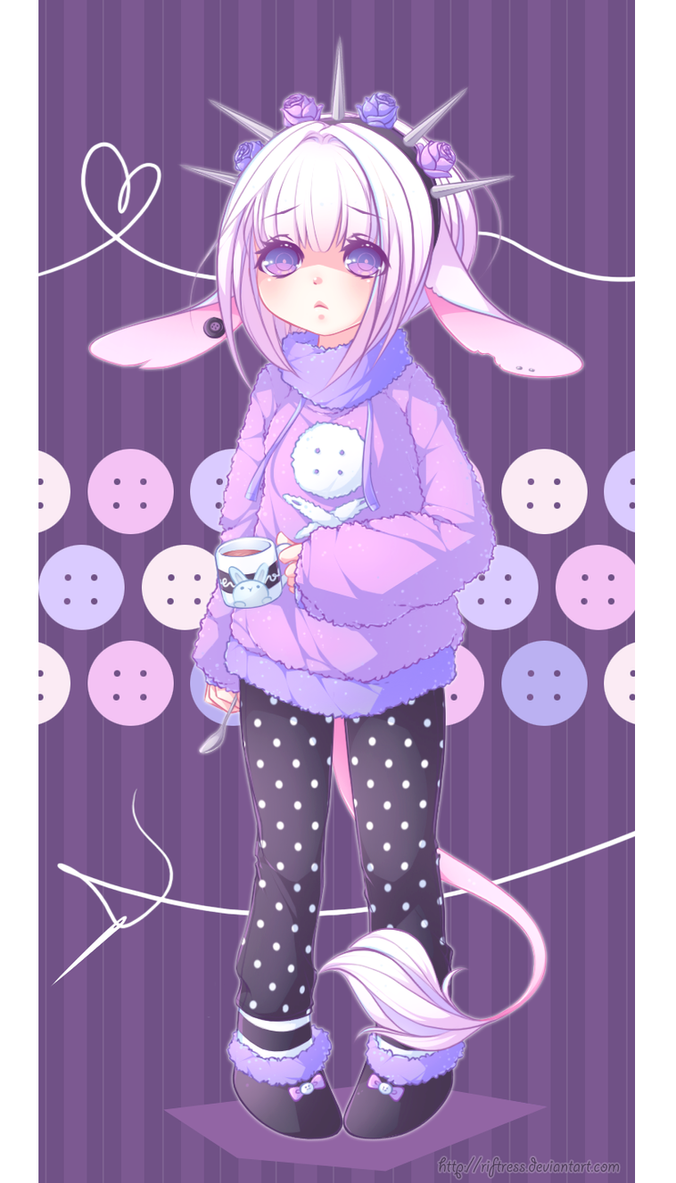
 expecially I'm interessed in the background (tecnique, style, colors, place...)
 Comments5
Join the community to add your comment. Already a deviant? Log In
Commented~ uwu
Commented. :3
Here are 3 of mine, I couldn't pick - feel free to pick whichever one you feel like commenting on.


Here are 3 of mine, I couldn't pick - feel free to pick whichever one you feel like commenting on.
I commented! I forgot to mention anything about the background, so I'll do that here. I think that maybe the background should be maybe a bit darker or have less detail with increasing depth. The background is very important no doubt, but currently the tones of the background are very similar to those in the face which distracts me a bit from the really nice face you've drawn! I think a little contrast would help pull the face forward a bit more. I know you said it is still a WIP though. But overall, really nice work!  (Smile)")
